
Saturday, July 26, 2014
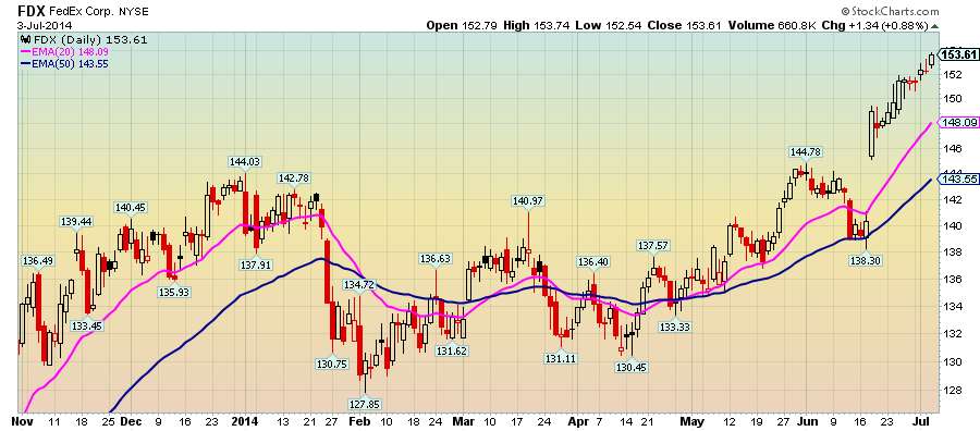
$FDX - FedEx's indictment for drug dealing won't hurt share prices long-term
It may be a buying opportunity short-term.
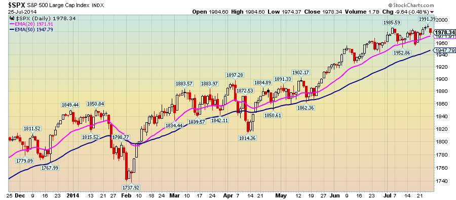
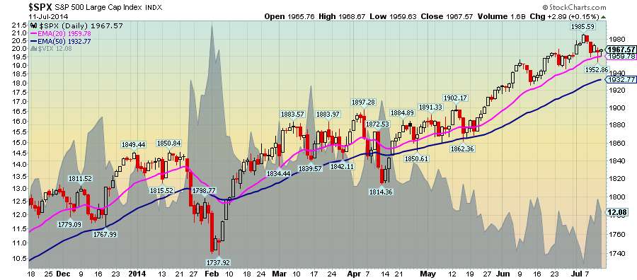
S&P 500 Pause in momentum or calm before the storm
It's only 5 points higher than where it started on July 1.
Friday, July 25, 2014
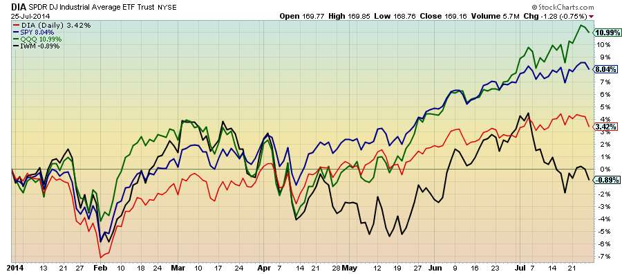
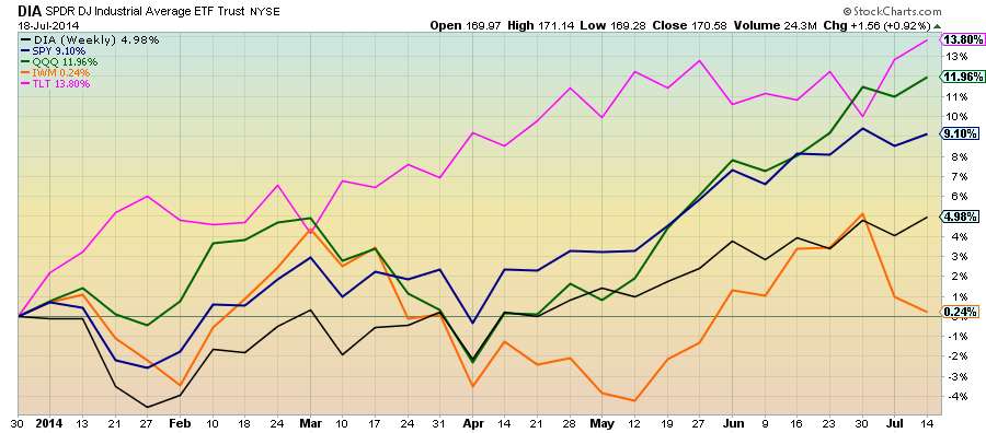
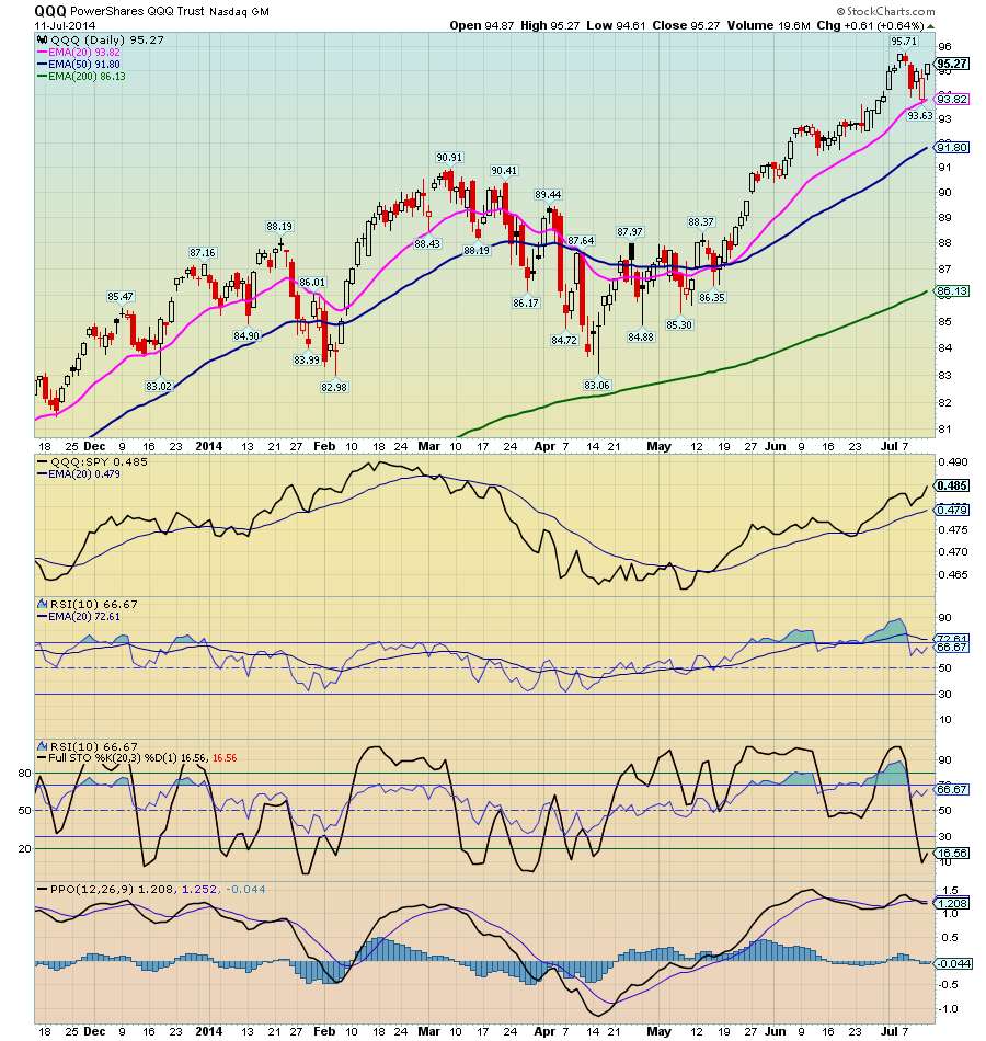
$DIA, $IWM, $QQQ, $SPY weekly performance
$QQQ led weekly performance and moved up from #2 to #1.
Click here for Major Index ETFs Weekly Performance
Wednesday, July 23, 2014

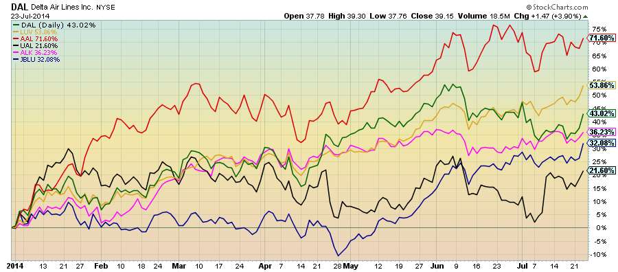
$UAL - United Continental has lagged its peers
It will benefit as the airline industry posts solid results in Q2.


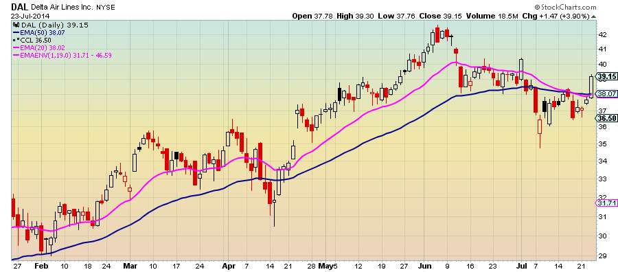
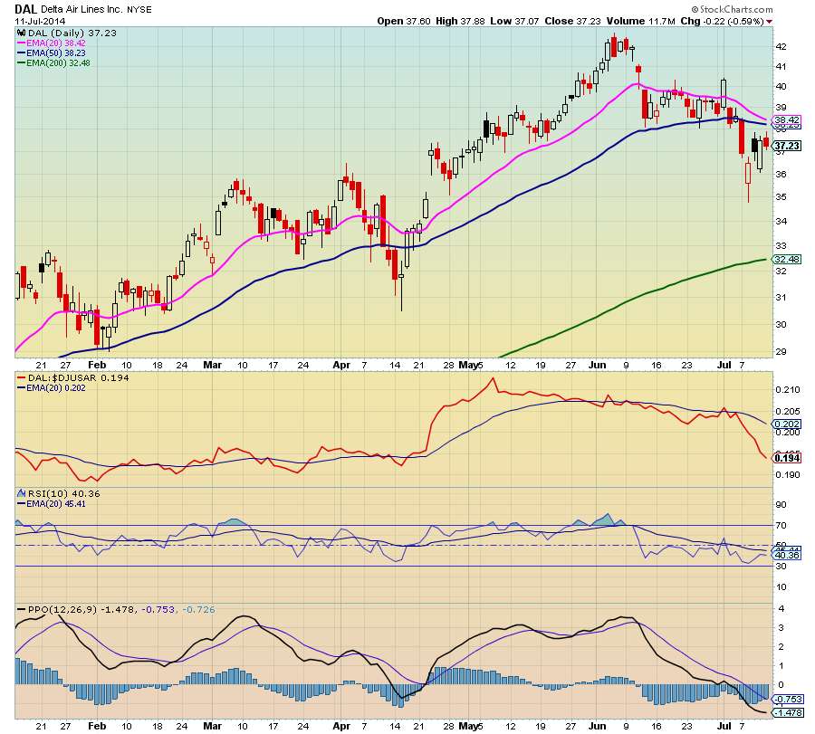
$DAL - Delta Air Lines loves to fly and it shows
Delta's profits beat forecasts and the stock is expected to rise higher. If Delta is any indication airlines shares will go higher.
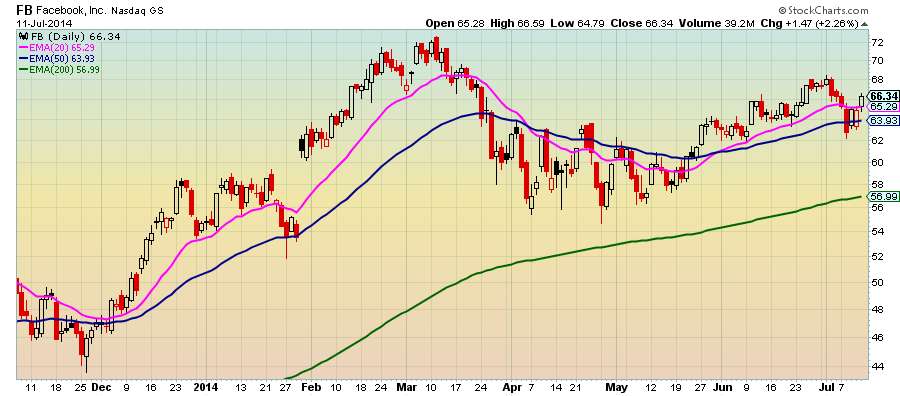
$FB - Facebook stock hits record high of $75 in after-hours trading
Investors are smiling as Facebook exceeds analysts expectations.

Monday, July 21, 2014
Sunday, July 20, 2014
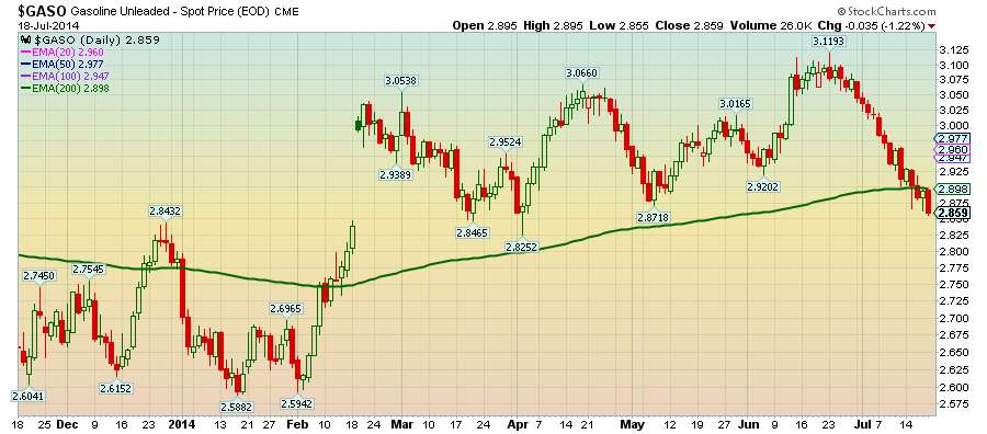
Is resistance futile? Gasoline prices are below the green line
Let's hope the 200-day moving average acts as resistance and gasoline prices continue to fall
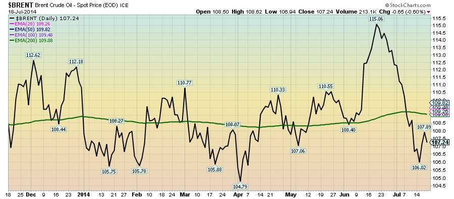
$BRENT - Back to normal?
After reaching $115/barrel Brent crude oil is back to dancing around the 200-day moving average.
My 401K: S&P 500 - Keeping it simple by seeing the forest instead of the trees
#my401K The chart below is the one I use the most to help me manage my 401K. It prevents me from reacting every time there is sensational news about the stock market's ups and downs. It's a weekly chart of the 10 week and 50 week simple moving average of the S&P 500 (I like things simple). Why the S&P 500? Well, it represents 500 of the largest companies in the stock market. If there are problems here, there are problems everywhere which is why it's a good gauge of the health of the market.
The chart helps me determine if I need to change the allocation of stock funds in my investments. As long as the pink line is above the blue line my stock fund allocation stays the same although I may re-balance among the stock funds in my plan. The black line which is the weekly price of the S&P 500 is my early warning signal that I may need to make an adjustment. When the black line crosses the pink line I start paying attention to the pink line and it's relationship to the blue line.
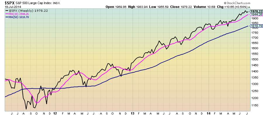
The chart helps me determine if I need to change the allocation of stock funds in my investments. As long as the pink line is above the blue line my stock fund allocation stays the same although I may re-balance among the stock funds in my plan. The black line which is the weekly price of the S&P 500 is my early warning signal that I may need to make an adjustment. When the black line crosses the pink line I start paying attention to the pink line and it's relationship to the blue line.
Saturday, July 19, 2014
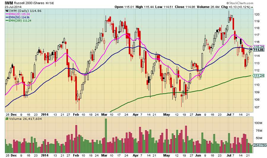
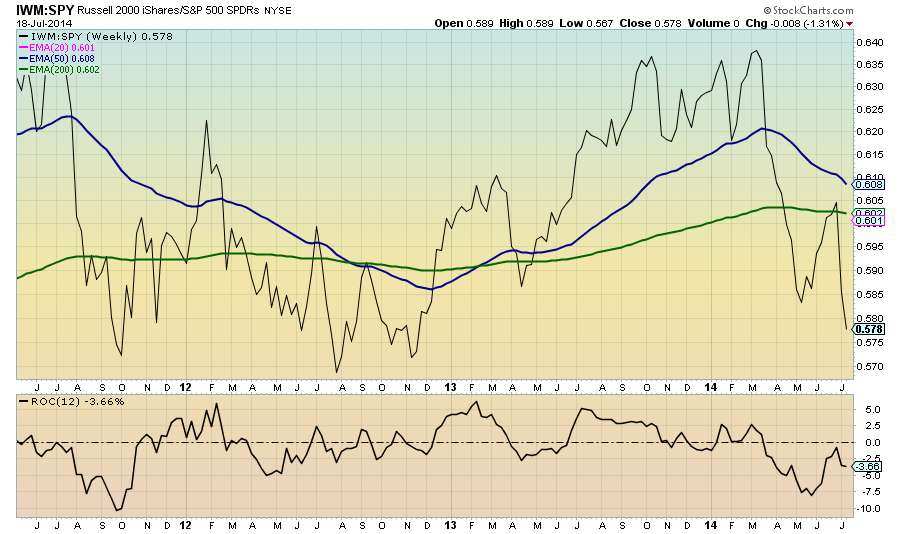
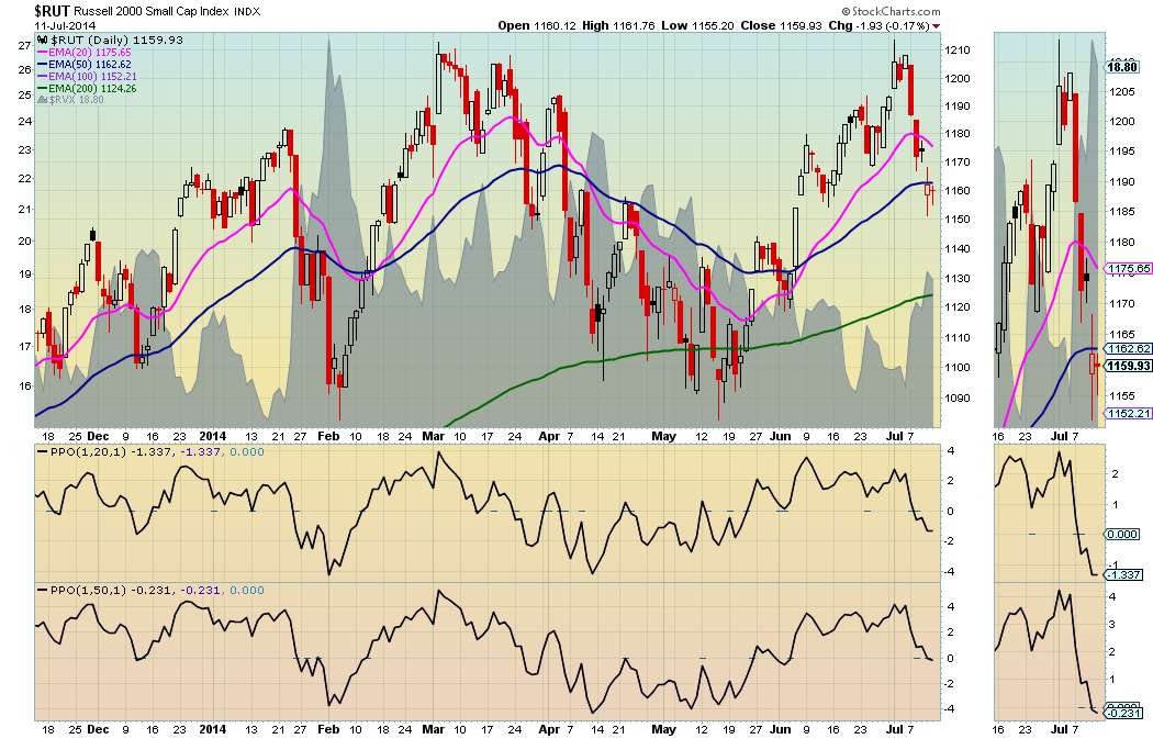
IWM:SPY Ratio - Small caps continue to show relative weakness
Investors are showing an aversion for the risk inherent in small stocks which is why the Russell 2000 is underperforming.
Friday, July 18, 2014
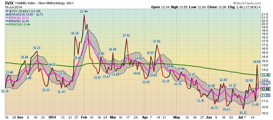
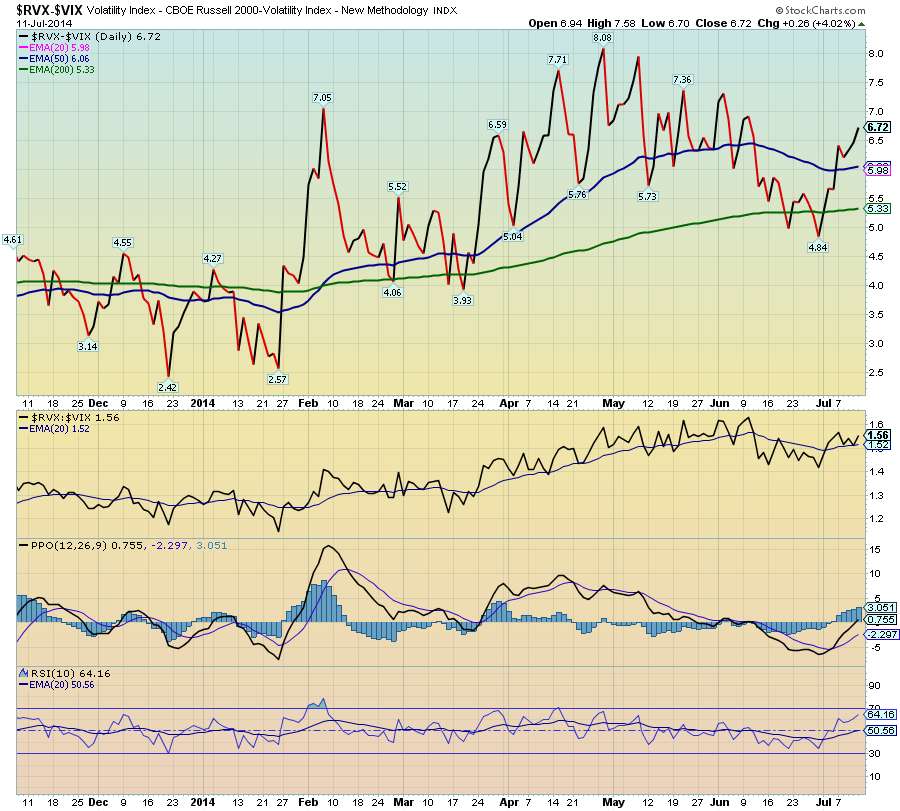
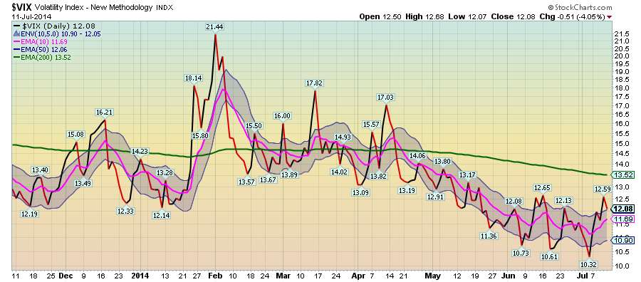
$VIX - Volatility spikes are great buying opportunities
When volatility spikes in a bullish market with no change in fundamentals it's a buying opportunity.

Sunday, July 13, 2014
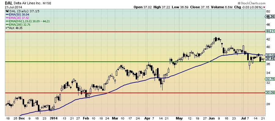
Down in the Delta - $DAL showing relative weakness, but may be a buy
After flirting above $42 Delta Air Lines is 12% below its all time and is showing relative weakness when compared to the Dow Jones US Airlines Index. Support is around $36 so it may be a chance to buy low or purchase some long-term calls at a fraction of the share price. For those looking for an entry point wait until RSI crosses above 50 and PPO crosses above its signal line.
Saturday, July 12, 2014

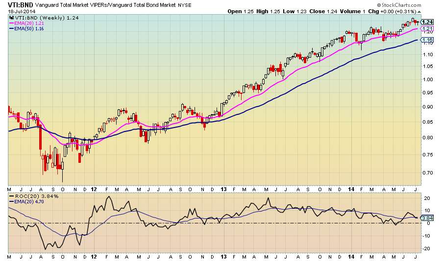
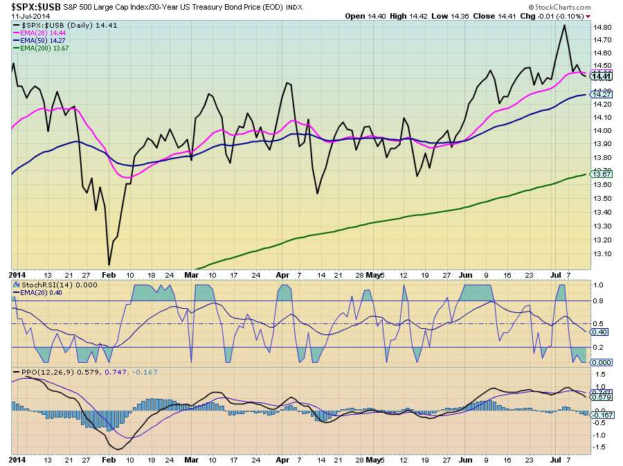
$SPX:$USB: Stock/Bond ratio has started to trend downward showing a shift toward bonds
The ratio crossed the 20-day moving average downward. The 20-day moving average of the StochasticRSI revealed a potential shift in early June.
$FDX employees may have up to 30 investment options in their 401K plan.
There are only 5 + 2 that need to be considers for your 401K investments.
$PHG Philips employees have 24 investment choices in their 401K
You only need to focus on 7 index funds + 1. Ignore the rest.
Dell employees have over 22 investment options in their 401K
Keep it simple by only focusing on the 5 index funds in the investment options + 2 more. That narrows the 22 down to just 7.
401K: Can't decide on what fund to choose in your 401K?
#401K. I am a big believer in index investing for 401Ks due to their low expense ratios. Actively managed funds have higher expense ratios and investment managers don't beat indexes on a consistent basis.
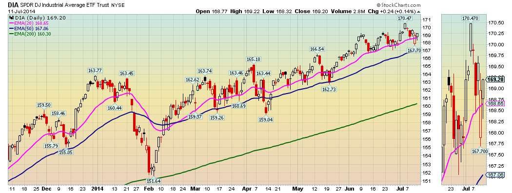
Friday, July 11, 2014

Age ain't nothing but a number
Take your age and subtract 15 years (no, that doesn't make you any younger), but it does make you feel good.
The result is how much of your 401K portfolio should be in bonds. The rest should be in stocks. So, if you are 50 years old you should have 35% of your portfolio in bonds and 65% in stocks. Of course, you can change the mix as you deem appropriate depending on if you are an aggressive, moderate, or conservative investor. My mix is for moderates and investors who want to invest and check on their 401Ks every now and then.
The result is how much of your 401K portfolio should be in bonds. The rest should be in stocks. So, if you are 50 years old you should have 35% of your portfolio in bonds and 65% in stocks. Of course, you can change the mix as you deem appropriate depending on if you are an aggressive, moderate, or conservative investor. My mix is for moderates and investors who want to invest and check on their 401Ks every now and then.
What's going on with my 401K?
Since I manage the 401Ks of a few relatives they look up and hear something about the market every now and then and call me. I always say don't pay attention to the daily news about the stock market because it will drive you crazy. I will call you when I get concerned. That puts them at ease and they hang up. If you are a #401K or IRA investor you must have a long-term outlook with an investment portfolio that adjusts over time. I will say more about this in future posts.
Thursday, July 10, 2014
The end of the world is not nigh...
No one can predict the stock market. It goes up. It goes down. It goes sideways. It is what it is. I was watching one of those stock market news channels which I don't normally watch (soap opera watcher) where I heard "experts" making predictions about the direction of the market. If they actually knew where the market was going they wouldn't tell anyone. Trust me!
Saturday, July 5, 2014
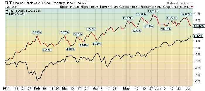
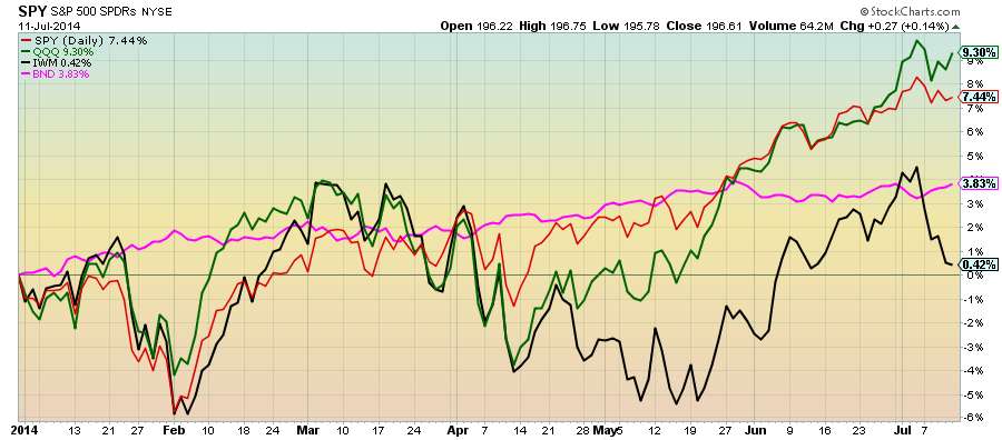
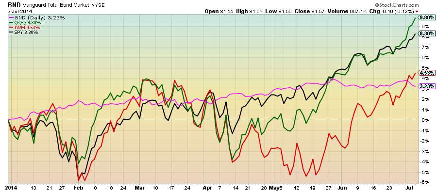
Bonds aren't getting much love as the market sets new highs.
But, they help offset the volatility inherent in the market as seen by performance.
Subscribe to:
Posts (Atom)